How to Choose Office Furniture Colors That Reflect Your Brand Without Looking Gimmicky
Your company’s brand colors look great on your website, business cards, and marketing materials. But translating those colors into office furniture requires restraint and strategy. An Arlington office with every surface in corporate red quickly goes from branded to overwhelming. The challenge is incorporating brand identity into your workspace without creating an environment that feels more like a theme park than a professional office.
Understanding the 60-30-10 Rule
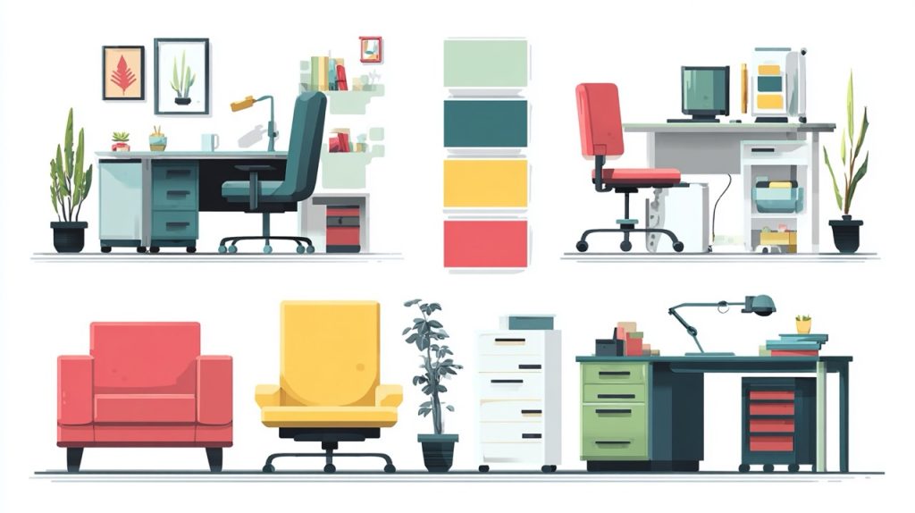
Interior designers rely on the 60-30-10 rule for balanced color schemes, and it applies perfectly to office furniture with brand considerations. Sixty percent of your office should be a neutral base color—typically grays, whites, or natural wood tones. Thirty percent should be a secondary color that complements your brand. Ten percent can be your primary brand color as accent pieces.
This approach prevents brand color oversaturation while ensuring your identity remains visible. If your brand uses bold blue, make that blue appear in 10% of the space through accent chairs, artwork, or desk accessories. The restraint makes those blue elements stand out rather than overwhelming the senses.
Most successful implementations keep quality standing desks and primary workstations in neutral finishes. This creates a professional foundation that allows brand colors to shine in strategic locations without making employees feel like they’re working inside your logo.
Strategic Color Placement
Where you place brand colors matters as much as how much you use. Client-facing areas—reception, conference rooms, and common spaces—work well for bolder brand color integration. These spaces benefit from distinctive branding while employees don’t spend entire days surrounded by saturated color.
Consider a tech company with bright green branding. Their reception area might feature green accent chairs and a green-backed seating area. Conference rooms could incorporate green through artwork or a feature wall, while the actual furniture remains neutral. This creates memorable branded spaces without the fatigue that comes from working in oversaturated environments.
Work areas should lean heavily toward neutral palettes with minimal brand color. Research shows that neutral work environments with selective color accents support better focus and reduce eye strain compared to heavily colored spaces. Save your brand colors for break rooms, collaboration spaces, and circulation areas where people spend shorter periods.
Texture and Material as Branding Tools
Brand identity extends beyond color to materials and textures. A law firm emphasizing tradition and stability might use rich leather and wood finishes regardless of specific colors. A tech startup projecting innovation could lean toward metal, glass, and modern synthetics.
These material choices reinforce brand positioning without requiring explicit color matching. A consulting firm with navy blue branding could express that through choice of sophisticated fabric textures and finishes rather than painting everything navy. The subtlety creates a more refined branded environment.
This approach also provides flexibility. Material-based branding doesn’t become dated as quickly as color-specific choices. If your brand colors evolve during a refresh, furniture chosen for material quality and texture remains relevant rather than requiring complete replacement.
Avoiding Common Brand Color Mistakes
The most common mistake is literal interpretation—thinking brand colors must appear exactly as they do in your logo. Brand red in print often looks different than brand red on fabric or furniture finishes. Colors that work in small doses on marketing materials can overwhelm when covering entire furniture pieces.
Instead of exact color matching, aim for colors that harmonize with your brand palette. If your brand uses bright orange, furniture in warm terracotta or burnt orange tones evokes your brand without the intensity of pure orange furniture. This approach prevents the theme park effect while maintaining color psychology connections to your brand.
Another mistake is forgetting about longevity. Brands evolve, but furniture represents a multi-year investment. Heavy investment in very specific brand color furniture creates problems if your brand identity shifts. Neutral foundations with changeable accent pieces provide flexibility as your brand matures.
Multi-Brand Offices and Color Neutrality
Some offices house multiple brands or client teams with distinct identities. In these environments, heavy brand color integration for any single identity creates conflicts. The solution involves neutral common areas with brand expression limited to individual team zones.
A creative agency serving multiple clients might have neutral conference rooms and reception areas, while individual team spaces incorporate colors reflecting their client’s brands. This approach maintains professional neutrality in shared spaces while giving teams some identity expression in their dedicated areas.
The key is establishing clear boundaries. Transitioning from neutral shared spaces into branded team zones should feel intentional rather than haphazard. Defined thresholds—doorways, different flooring, or architectural elements—signal the shift from neutral to branded space.
Testing Color Choices Before Commitment
Before ordering furniture in brand colors, test samples in your actual space. Colors look dramatically different under office lighting than in showrooms or on computer screens. Northern Virginia offices with large windows face different lighting conditions than interior DC offices.
Request fabric samples, finish samples, and paint chips. Place them in your office for several days, observing how they look at different times of day and under various lighting conditions. What looks perfect at 10am might feel overwhelming by 4pm when afternoon sun shifts.
Consider employee feedback before making large purchases. The people working in the space daily have valuable perspective on whether color choices enhance or distract from their work environment. A marketing team might embrace bold brand colors, while your accounting department might find the same choices distracting.
Ready to create a branded workspace that feels professional rather than gimmicky? Contact us at All Business Systems for expert advice on incorporating brand colors into office furniture tastefully.